
Imagine this: every product photo you share isn’t just a snapshot, it’s a chapter in a bigger story. As your customers scroll through your website or Instagram feed, they don’t just see your logo and think, “Oh, that’s nice.” They feel something. They know it’s you because every image flows together, like pieces of the same puzzle. That’s what a cohesive visual style can do. In a world where we’re all bombarded with images daily, it’s not enough for your products to look pretty; they need to feel like they belong together, leaving a vibe that lingers and pulls people back.
I know, creating a consistent look for your brand’s photos might sound like a lot. Maybe you’re a small business owner snapping pics of your handmade candles with your phone, or a marketer trying to make a whole product line pop, or even a creative entrepreneur just getting started. Wherever you’re at, I promise you can nail this. A unified aesthetic isn’t just for big brands with fancy studios, it’s for anyone who wants to make their products shine, build trust with their audience, and turn one-time browsers into lifelong fans.
In this article, I’m sharing three simple, tried-and-true techniques to make your A Cohesive Aesthetic In Product Photography feel part of the same story. We’ll talk about picking color palettes that scream you, nailing lighting that sets the mood, and using composition tricks to make every shot feel intentional. By the end, you’ll have the tools to take your visuals from “meh” to “whoa,” creating a polished, professional look that people won’t forget.
Let’s dive in and make your product photos tell an authentic, inviting, and totally unforgettable story.
Understanding Your Brand’s Visual Identity
Your brand’s visual identity is far more than just a logo or a splash of color; it’s the heart and soul of how your audience connects with you. It’s the emotions they feel, the values they sense, and the stories they associate with your brand. By weaving a consistent and thoughtful aesthetic into your product photography, you can craft a powerful visual story that speaks directly to your audience’s heart. Every image should do more than showcase a product; it should spark emotions, reflect your brand’s mission, and invite your audience into your world. Here’s how to bring that vision to life with a more humanized and detailed approach:
- Tap into emotions with intentional imagery: Your photos should feel alive, capturing the essence of what your brand stands for. Think about the mood you want to evoke, whether it’s the cozy warmth of a handcrafted candle or the bold confidence of a sleek tech gadget. For example, a coffee brand might use rich, golden lighting to mimic the glow of a morning brew, instantly making viewers feel comforted and energized.
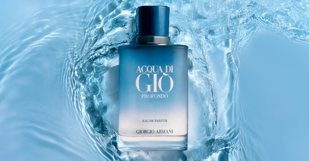
- Use lighting to set the tone: Lighting isn’t just technical, it’s emotional. Soft, natural light can make your products feel approachable and authentic, like a friend inviting you in. On the other hand, dramatic, high-contrast lighting might convey luxury or intensity, perfect for a premium fashion line. Experiment with what feels true to your brand’s personality and watch how it transforms the story your photos tell.
- Craft compositions that draw the eye and heart: A well-composed photo is like a good conversation; it flows naturally and keeps you engaged. Place your product thoughtfully, using negative space or complementary props to highlight its beauty without overwhelming the viewer. For instance, a minimalist skincare brand might place a single bottle against a clean, textured background to emphasize purity and quality.
- Choose colors that resonate: Colors speak a language of their own. A vibrant, playful palette might suit a youthful, fun brand, while muted, earthy tones could align with a sustainable, eco-conscious mission. Ensure your color choices reflect your brand’s values and create a cohesive thread across all visuals, making your products instantly recognizable.
- Stay consistent to build trust: Imagine your brand as a familiar face your audience loves seeing. Consistency in your visual style, whether it’s the same filter on Instagram, a signature backdrop on your website, or a unified look in print ads, helps your audience feel at home with your brand. This familiarity breeds trust, loyalty, and that warm feeling of “this is my brand.”
- Tell a story in every frame: Every photo is a chance to share a piece of your brand’s journey. Ask yourself: What’s the story behind this product? Maybe it’s the craftsmanship of artisans or the innovation of a cutting-edge design. Use props, settings, or even subtle details like a worn-in journal or a fresh sprig of lavender to weave that narrative into the image.
- Make it relatable and real: Your audience wants to see themselves in your visuals. Show your product in moments that feel human, like a cozy sweater draped over a chair on a rainy day or a sleek phone capturing a spontaneous adventure. These relatable scenes help your audience imagine your product in their own lives, forging a deeper connection.
- Curate a seamless experience across platforms: Whether someone encounters your brand on TikTok, your website, or a billboard, the visual vibe should feel like it’s coming from the same creative soul. This doesn’t mean every photo needs to be identical, but a cohesive aesthetic, like a consistent editing style or recurring motifs, ties everything together beautifully.
By pouring thought and care into these elements, your product photography becomes more than just images; it becomes a love letter to your audience. It’s a way to say, “We get you, and we’re here to bring something meaningful to your life.” A strong, cohesive visual identity not only makes your brand unforgettable but also builds a loyal community of people who feel connected to your story.
Choosing a Consistent Color Palette

A consistent color palette is vital in achieving a cohesive aesthetic in product photography, as it helps to create a visual narrative that resonates with your brand identity. When selecting colors, consider the emotions and messages you wish to convey; for instance, warm tones can evoke feelings of comfort and approachability, while cool tones often communicate professionalism and tranquility. By strategically choosing a limited palette, you not only enhance the visual appeal of your images but also ensure that they remain instantly recognizable across various platforms.
Moreover, the interplay between colors can significantly influence the viewer’s perception of your products. Utilizing complementary colors can create striking contrasts that draw attention to specific items, while analogous colors foster a sense of harmony that encourages viewers to engage with the entire collection. It’s also essential to account for lighting and background elements that may affect how your chosen colors appear in photographs. Ultimately, a well-thought-out color palette not only elevates the aesthetic of your product photography but also reinforces brand consistency, making it easier for customers to connect with your offerings on an emotional level.
Utilizing Textures and Backgrounds Effectively
Textures and backgrounds are like the secret sauce in product photography they transform a simple snapshot into a story that grabs your audience’s heart. They’re not just about making things look pretty; they’re about creating a vibe, a feeling, a connection that makes someone stop scrolling and think, “I need this in my life.” By thoughtfully choosing textures like weathered wood, soft linen, or sleek metal, and pairing them with the right backgrounds, you can bring your products to life in a way that feels tactile, relatable, and unforgettable. Here’s a deeper dive into how to make textures and backgrounds work magic for your brand:
- Embrace textures to make photos feel alive: Textures add a touchable quality that pulls people in, making them feel like they can reach out and grab your product. Think about the contrast between a glossy ceramic mug resting on a chunky, knitted throw it’s cozy yet refined, instantly evoking warmth. Or picture a sleek leather wallet against a rugged concrete slab; the mix of grit and polish screams sophistication. These tactile contrasts don’t just highlight your product, they tell a story about its personality and place in the world.
- Choose textures that echo your brand’s soul: Every texture should feel like an extension of your brand’s story. If you’re a sustainable jewelry brand, try photographing your pieces on natural elements like smooth river stones or reclaimed wood to nod to your eco-conscious values. For a high-tech gadget, a brushed metal or glossy glass surface might amplify its cutting-edge vibe. Ask yourself: What does my brand stand for, and how can texture bring that to life?
- Play with background colors to set the mood: Colors aren’t just visual, they’re emotional. A soft, neutral background like creamy beige or pale gray lets your product shine without distraction, perfect for minimalist brands that value simplicity. On the flip side, a bold, vibrant backdrop like a sunny mustard yellow or a deep emerald green can infuse energy and playfulness, ideal for a youthful, spirited brand. Whatever you choose, make sure the color complements your product and aligns with the feelings you want to spark in your audience.
- Use patterns sparingly to add personality: A patterned background can be a game-changer, but it’s like a strong spice use it wisely. A subtle geometric print or a delicate floral pattern can add charm and character without stealing the spotlight. For example, a handmade soap bar might pop against a faintly textured, botanical-inspired backdrop, hinting at its natural ingredients. Just ensure the pattern doesn’t overpower your product; harmony is key.
- Create depth for a dynamic, inviting shot: Flat photos can feel, well, flat. To give your images that “wow” factor, experiment with layers and depth. Try a slightly blurred background to mimic a shallow depth of field, making your product the star while still suggesting a rich, lived-in setting. Or layer textures like a linen tablecloth over a wooden table to add dimension. This approach draws the viewer’s eye naturally to the product while keeping the scene engaging.
- Keep it cohesive to build brand recognition: Your textures and backgrounds should feel like they belong to the same family, even if they vary slightly. Maybe your brand always uses organic textures like wood, clay, or cotton to evoke earthiness, or perhaps you lean into sleek, modern surfaces like marble and glass. Consistency across your photos whether on your website, Instagram, or packaging helps your audience instantly recognize your brand, fostering trust and that warm, familiar feeling.
- Balance contrast and harmony: The magic happens when textures and backgrounds complement the product without clashing. A rough, distressed wooden backdrop might make a delicate porcelain dish feel grounded and artisanal, but pair that same dish with a busy, neon-patterned background, and it could feel chaotic. Test different combinations to find that sweet spot where the product shines, and the background enhances its story.
- Tell a story with every choice: Every texture and background is a chance to share a piece of your brand’s narrative. Imagine a rustic picnic scene for a gourmet food brand, with a checkered cloth and weathered wood evoking nostalgia and togetherness. Or a futuristic tech accessory shot against a glossy black surface with neon accents, screaming innovation. Think about the lifestyle your product represents and let your textures and backgrounds paint that picture.
- Make it human and relatable: Your audience wants to see your product in a world they can imagine themselves in. A cozy scarf photographed on a soft wool blanket with a steaming mug nearby feels like a chilly morning waiting to be warmed up. A fitness tracker on a gritty gym floor with a water bottle in the background speaks to sweat and determination. These little details make your photos feel less like ads and more like moments.
By weaving textures and backgrounds into your product photography with care and intention, you’re not just taking pictures you’re crafting a visual love letter to your audience. You’re inviting them to feel something, to see themselves in your brand’s world, and to fall in love with what you’re offering. Mastering this art takes experimentation and heart, but the result is a cohesive, memorable aesthetic that makes your brand stand out and sticks with people long after they’ve seen your photos.
Selecting Complementary Props for Products

When selecting complementary props for product photography, it’s essential to consider how each element contributes to a cohesive aesthetic. The right props can enhance the product’s story, drawing attention to its features while providing context that resonates with the target audience. For instance, if you’re photographing artisanal skincare products, incorporating natural elements like stones or greenery can evoke a sense of purity and connection to nature, creating an inviting atmosphere that aligns with consumer values.
Moreover, color harmony plays a crucial role in achieving a cohesive aesthetic. Props should not only complement the product’s palette but also reflect the overall mood you wish to convey. Utilizing soft pastels for delicate items or bold, contrasting colors for statement pieces can amplify visual interest without overwhelming the main subject. By thoughtfully curating your selection of props considering texture, shape, and size, you can create a balanced composition that captures attention and drives engagement, ultimately leading to a stronger emotional response from potential buyers.
Editing for a Harmonious Final Look
Editing product photography is like adding the final brushstrokes to a painting it’s where the magic comes together to create a look that feels uniquely you. It’s not just about tweaking brightness or slapping on a filter; it’s about pouring your brand’s heart and soul into every image so that each one tells a story, sparks a feeling, and pulls your audience closer. Thoughtful editing weaves individual photos into a cohesive visual tapestry, one that reflects your brand’s identity and leaves a lasting impression. Here’s how to make your editing process more human, intentional, and impactful:
- Set the mood with color grading: Colors are the language of emotion. By using color grading, you can create a palette that feels like your brand’s signature vibe whether it’s the warm, golden hues of a cozy lifestyle brand or the cool, sleek tones of a tech innovator. For example, a bakery might lean into soft pastels to evoke sweetness and comfort, while a fitness brand could use bold, high-contrast colors to scream energy and determination. Consistent color grading across your photos ties them together, making your brand instantly recognizable.
- Craft a unified narrative: Every image should feel like a chapter in your brand’s story, not a standalone moment. Think about how your edits can connect the dots. If you’re a sustainable fashion brand, earthy tones and gentle contrasts might run through every shot to highlight your eco-conscious ethos. Editing with intention ensures that whether someone sees your photos on Instagram, your website, or a catalog, they’re immersed in the same world one that feels cohesive and true to who you are.
- Pay attention to the little details: The tiniest tweaks can make a huge difference. Consistent shadows give your images depth and realism, while unified highlights make your products pop naturally. Textures, too, should feel harmonious whether it’s the grain of wood or the sheen of metal, ensure they complement each other across your shots. These details might seem small, but they’re what turn a good photo into one that feels polished and professional, inviting viewers to linger.
- Use selective adjustments to highlight what matters: Not every part of an image needs equal attention. Tools like layer blending or selective adjustments let you draw the viewer’s eye exactly where you want it like the intricate stitching on a handbag or the sparkle of a gemstone. By subtly boosting contrast or saturation on key features, you can make your product shine without overwhelming the rest of the composition. It’s like spotlighting the star of the show while keeping the stage beautifully balanced.
- Keep it natural and relatable: Over-editing can make photos feel artificial, distancing your audience. Aim for a look that’s polished but still human like the product could exist in their everyday life. For instance, a skincare brand might soften skin tones in product shots to feel approachable, but avoid airbrushing to the point of looking unreal. Let your edits enhance the product’s beauty, not rewrite it, so your audience feels a genuine connection.
- Create consistency for trust and familiarity: Imagine your brand as a friend your audience loves catching up with. Consistent editing whether it’s the same level of brightness, a signature color tone, or a specific texture style makes every interaction with your brand feel familiar and comforting. This consistency builds trust, making your audience feel like they know what to expect and can rely on your brand to deliver that same quality every time.
- Evoke emotions that align with your mission: Every edit is a chance to make your audience feel something. If your brand is all about adventure, bold contrasts and vibrant colors might capture that thrill. If you’re about mindfulness, soft gradients and muted tones can evoke calm. Think about the emotions tied to your brand’s values joy, nostalgia, empowerment and use editing to bring those to life in a way that resonates deeply.
- Balance creativity with clarity: While it’s tempting to get artsy with filters or dramatic effects, your product should always be the hero. Creative edits are great, but they should never obscure what you’re selling. A jewelry brand might use a dreamy vignette to add elegance, but ensure the gemstones still sparkle clearly. Strike a balance where your edits enhance the storytelling without stealing the spotlight from the product itself.
- Test and refine your editing style: Finding your brand’s editing sweet spot takes time and experimentation. Try different color grades, play with shadow depths, or test out subtle texture enhancements to see what feels right. Over time, you’ll develop a go-to editing recipe that’s uniquely yours one that your audience will come to love and associate with your brand.
By approaching editing with heart and intention, you’re not just polishing photos you’re breathing life into your brand’s story. You’re creating a visual experience that feels cohesive, authentic, and unforgettable, drawing people in and making them want to be part of your world. Thoughtful editing doesn’t just attract customers; it builds a loyal community who sees your brand as more than a product it’s a feeling, a lifestyle, and a story they want to keep coming back to.
Elevate Your Product Photography Today
Achieving a cohesive aesthetic in product photography is essential for creating a strong brand identity and engaging your audience. Start by selecting a consistent color palette that resonates with your brand’s ethos; this will help tie together various images and create a visually appealing narrative. Consider the use of props and backgrounds that complement your products without overshadowing them. A well-thought-out setup not only enhances the visual appeal but also communicates the lifestyle associated with your brand.
Lighting plays a crucial role in elevating your product photography. Natural light can add warmth and authenticity, while controlled studio lighting allows for precision and consistency. Experimenting with different light sources can uncover new textures and details, bringing your products to life. Additionally, incorporating shadows strategically can add depth and dimension, further enhancing the overall composition. By mastering these elements, you can create striking images that not only showcase your products but also evoke emotions and encourage consumer engagement.
Conclusion
Achieving a cohesive aesthetic in product photography is not merely a matter of technical skill but an art form that requires thoughtful consideration of various elements. From lighting and composition to color palettes and props, each aspect plays a crucial role in conveying a brand’s identity and message. A well-executed cohesive aesthetic can elevate the perception of a product, making it not just visually appealing but also emotionally resonant with potential customers.
Moreover, embracing consistency across different platforms ensures that the visual narrative remains intact, fostering brand recognition and trust. As consumers are increasingly drawn to authenticity and storytelling, a unified photographic approach can significantly enhance engagement and conversion rates. By investing time in crafting a coherent visual style, brands not only stand out in a crowded marketplace but also cultivate deeper connections with their audience. Ultimately, product photography is more than just an image; it’s a strategic tool that reflects the essence of a brand and its values.